使用matplotlib绘制统计直方图

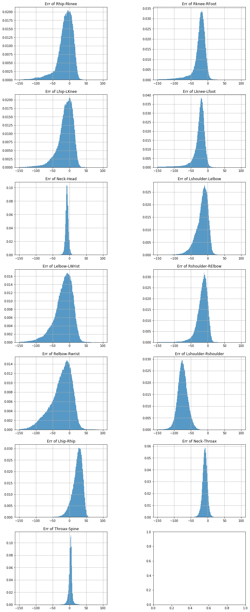
用matplotlib可以很方便地绘制图像,下面给出一个绘制含有13个子图的统计直方图示例:

示例代码

1
2
3
4
5
6
7
8
9
10
11
12
13
14
15
16
17
18
19
import matplotlib
from matplotlib import pylab
import matplotlib.pyplot as plt
Limb_List=['Rhip-Rknee','Rknee-RFoot','Lhip-LKnee','Lknee-Lfoot','Neck-Head','Lshoulder-Lelbow','Lelbow-LWrist','Rshoulder-RElbow','Relbow-Rwrist','Lshoulder-Rshoulder','Lhip-Rhip','Neck-Throax','Throax-Spine']

# fig = plt.figure()
f, axs = plt.subplots(7,2,figsize=(15,36))
for i in range(13):
pylab.subplot(7,2,i+1)
n, bins, patches =plt.hist(Err[:,i], 200, density=True, alpha=0.75,range=(-150,100))
plt.grid(True)
title='Err of '+Limb_List[i]
plt.title(title)

# plt.tight_layout()
# plt.suptitle("Error of Limb Length")
plt.subplots_adjust(left=0.2, wspace=0.5, top=0.88)
plt.show()
f.savefig('S11_err.png',bbox_inches="tight")

代码说明:

f, axs = plt.subplots(7,2,figsize=(15,36)) 这一行设置子图的大小,否则会使用默认的子图大小,在7x2的布局下会显得相当诡异。
pylab.subplot(7,2,i+1) 表明当前子图的序号
plt.subplots_adjust(left=0.2, wspace=0.5, top=0.88) 设置子图之间的间距,如果不设置,在每个子图都有title的情况下会导致子图的title与其他子图的坐标轴交叠
f.savefig('S11_err.png',bbox_inches="tight") 这里设置bbox_inches="tight"可以避免存储的图像中标题栏被截去。

示例图像

img